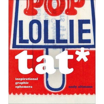
Tat* - by Andy Altmann (Hardcover)
Similar Products
Products of same category from the store
AllProduct info
<p/><br></br><p><b> About the Book </b></p></br></br>Tat* is a bit of a graphic designer's curse. Walk into any design studio and you will see tat pinned to the walls or placed with loving care on top of a computer screen. Even the purist will have a secret cache hidden away somewhere. Andy Altmann began collecting tat while he was on his Foundation course, getting ready for an interview at St Martins School of Art. He'd been asked to present a sketchbook, but worried that he couldn't draw very well, he decided to start a scrapbook: "I rummaged through the drawers at home and found some football cards from the late 1960s and early '70s (plenty of Georgie Best), an instruction leaflet from an old Hoover, Christmas cracker jokes, and so on. Then I started on the magazines, cutting out images of anything that interested me. And finally I took myself off to the college library, where I photocopied things from books before reaching for the scissors and glue." It was the beginning of a significant collecting habit. So what it is that makes a piece of graphic tat interesting? Is it the 'retro' thing - a fascination with a bygone age, the primitive printing techniques, the naivety of the design, or the use of colour? All of the above, of course, but it's not quite that simple. "Occasionally people offer me something they've found that they think I might like", says Andy. "But usually they're wrong - it doesn't excite me at all. The magic is missing." * tat (noun) - anything that looks cheap, is of low quality, or in bad condition; junk, rubbish, debris, detritus, crap, shite. --<p/><br></br><p><b> Book Synopsis </b></p></br></br>Tat* is a bit of a graphic designer's curse. Walk into any design studio and you will see tat pinned to the walls or placed with loving care on top of a computer screen. Even the purist will have a secret cache hidden away somewhere. Andy Altmann began collecting tat while he was on his Foundation course, getting ready for an interview at St Martins School of Art. He'd been asked to present a sketchbook, but worried that he couldn't draw very well, he decided to start a scrapbook: "I rummaged through the drawers at home and found some football cards from the late 1960s and early '70s (plenty of Georgie Best), an instruction leaflet from an old Hoover, Christmas cracker jokes, and so on. Then I started on the magazines, cutting out images of anything that interested me. And finally I took myself off to the college library, where I photocopied things from books before reaching for the scissors and glue." It was the beginning of a significant collecting habit. So what it is that makes a piece of graphic tat interesting? Is it the 'retro' thing - a fascination with a bygone age, the primitive printing techniques, the naivety of the design, or the use of color? All of the above, of course, but it's not quite that simple. "Occasionally people offer me something they've found that they think I might like", says Andy. "But usually they're wrong - it doesn't excite me at all. The magic is missing." To a graphic designer, most the content of this book can safely be regarded as 'bad' design. But there is some magic in each and every piece that has made Andy either pick it up off the street, trail through online links, or enter some dodgy looking shop on the other side of the world just to snap it up. Here you'll find everything from sweet wrappers to flash cards, from soap powder boxes to speedway flyers, from wrestling programmes to bus tickets. More tat than you can shake a stick at. Taken together, it represents a lifetime of gleeful hunting and gathering. * tat (noun) - anything that looks cheap, is of low quality, or in bad condition; junk, rubbish, debris, detritus, crap, shite<p/><br></br><p><b> About the Author </b></p></br></br>Andy Altmann is a founding partner at Why Not Associates - one of the UK's leading multi-disciplinary design companies. Andy founded Why Not Associates in 1987, with fellow Royal College of Art graduates David Ellis and Howard Greenhalgh. Although he trained as a graphic designer, Andy's work has taken him into the blurred boundaries of design and art. In over 30 years of experience he has worked on projects ranging from exhibition design to postage stamps, via advertising, publishing, television titles, commercials, corporate identity and large-scale public art. His clients include the Royal Academy of Arts, Channel 4, V&A, Grace Jones, Pompidou Centre, Royal Mail, Nike, Paul Smith, Chris Ofili, Kobe Museum of Fashion, and Tate Modern. All his work is bound by a fundamental love of typography, research and experimentation. He has given numerous lectures on his work all around the world - from Siberia to Japan via Manchester! In 1991 Why Not Associates collaborated with Edward Booth-Clibborn and Rick Poyner to edit and design Typography Now: The Next Wave - which became the most significant, most referenced, best selling survey of typographic trends and thinking of its time. A monograph was published in 1998, documenting the first ten years of Why Not Associates' work and a second, published in 2004, documented another five years.
Price History
Cheapest price in the interval: 35.99 on October 22, 2021
Most expensive price in the interval: 35.99 on November 8, 2021
Price Archive shows prices from various stores, lets you see history and find the cheapest. There is no actual sale on the website. For all support, inquiry and suggestion messagescommunication@pricearchive.us
