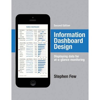
Information Dashboard Design - 2nd Edition by Stephen Few (Hardcover)

Similar Products
Products of same category from the store
AllProduct info
<p/><br></br><p><b> Book Synopsis </b></p></br></br>A leader in the field of data visualization, Stephen Few exposes the common problems in dashboard design and describes its best practices in great detail and with a multitude of examples in this updated second edition. According to the author, dashboards have become a popular means to present critical information at a glance, yet few do so effectively. He purports that when designed well, dashboards engage the power of visual perception to communicate a dense collection of information efficiently and with exceptional clarity and that visual design skills that address the unique challenges of dashboards are not intuitive but rather learned. The book not only teaches how to design dashboards but also gives a deep understanding of the concepts--rooted in brain science--that explain the why behind the how. This revised edition offers six new chapters with sections that focus on fundamental considerations while assessing requirements, in-depth instruction in the design of bullet graphs and sparklines, and critical steps to follow during the design process. Examples of graphics and dashboards have been updated throughout, including additional samples of well-designed dashboards.<p/><br></br><p><b> Review Quotes </b></p></br></br><br>Design does not happen by accident. It is the product of careful and deliberate planning. Stephen Few demonstrates this through examples and best practices that are easy to understand and will improve how we display and communicate information. Businesses that value design will leap ahead because they will be able to quickly assimilate information, efficiently focus time and efforts, and create alignment, agility, and effectiveness. This book provides a running head start! --Eleanor Taylor, strategist, SAS Institute<br><br>How nice to find a book in which the best practices for dashboard design are all thoughtfully packaged. You are advised to make these mandatory reading for your designers. --Claudia Imhoff, president, Intelligent Solutions, Inc.<br><br>Stephen Few is the master of creating simplicity and meaning through the clear visualization of data. --Garr Reynolds, author, <i>The Naked Presenter</i> and <i>Presentation Zen</i><br><br>Written by one of the foremost expert in the field of data visualization, this is one of those rare books that seem to make the publication of other works on the same topic unnecessary. This is a very complete book and was obviously developed with great care. I highly recommend Stephen Few's <i>Information Dashboard Design</i> to any information designers who are focusing on the visual display of data and, more particularly, to dashboard designers. --Pabini Gabriel-Petit, CEO and Principal User Experience Architect, Spirit Softworks<br><p/><br></br><p><b> About the Author </b></p></br></br><b>Stephen Few</b> is the founder of the consultancy Perceptual Edge. He speaks, teaches, and consults around the world and writes the quarterly Visual Business Intelligence Newsletter. He is the author of <i>Now You See It: Simple Visualization Techniques for Quantitative Analysis</i> and <i>Show Me the Numbers: Designing Tables and Graphs to Enlighten</i>. He lives in Berkeley, California.
Price History
Price Archive shows prices from various stores, lets you see history and find the cheapest. There is no actual sale on the website. For all support, inquiry and suggestion messagescommunication@pricearchive.us


